The PR Adviser: Awareness Starts With Your Online Store
Lilian Raji discusses the importance of having an intentional website design that aligns with your brand or store’s goals.

Awareness, whose sparkly, sequined cape flaps alongside the winds of change, stands ready to lead us down the platinum brick road of the customer journey towards the emerald-colored palace known as customer loyalty.
The winds of change? Absolutely! What got you here isn’t going to get you there, lovely grasshoppers! You must become more popular to go further, and popularity is the domain of awareness.
“So many brands give too little thought to their customers’ website experience yet expect visitors to just drop those Amex digits into checkout.” —Lilian Raji
But awareness isn’t taking you anywhere until we’ve examined your domain, which is to say, your website.
A direct-to-consumer strategy hinges on your website. There’s no point in driving traffic there only for our passengers to crash into a trainwreck of a site.
So many brands give too little thought to their customers’ website experience yet expect visitors to just drop those Amex digits into checkout. It doesn’t work like that, particularly if you’re trying to coax $5,000 from someone.
I’d planned an entire article on why Shopify is a must, but Emmanuel Raheb has saved me time. So, everything he said!
I can provide more reasons as to why Shopify is critical to your ecommerce strategy, but, as a consummate storyteller, I’d rather tell you a story.
I once advised an extremely stubborn designer who became even more stubborn when I pointed out why her non-Shopify ecommerce site wasn’t generating sales.
“It’s not an ecommerce site!” she screamed at me after the third time I referred to it as her ecommerce site.
In an act of patience my mother would swear didn’t happen, I calmly asked if customers could buy from her website. “Yes!” she said, glaring at me as if I’d asked if water was wet.
Ahem. Let’s see what Cambridge Dictionary says:
e-com·merce /ˈēˌkämərs/
the business of buying and selling goods and services on the internet.
The designer was convinced she had a portfolio site, which was her original intention when she first commissioned it.
But she later added ecommerce capabilities, turning her portfolio site into an ecommerce site because, as Cambridge corroborates, she was now selling goods on the internet.
To give you an idea of a portfolio site, let’s look at Todd Reed’s website.
The website is a virtual art gallery featuring a one-man show. It is simply exquisite in showcasing Todd’s masterful artistry and perfect if your primary concern is educating customers about you.
It is smartly built on Shopify, thus offering the option to buy. But this isn’t immediately obvious. In fact, you don’t even know you can buy without a couple of clicks, as there’s no clear indication.
To be clear, gentle readers, I’ve never spoken to Todd or his team about their website objectives. It’s very possible selling online isn’t a priority for the brand, which makes a portfolio website with ecommerce capabilities absolutely fine, particularly since the website does an immaculate job of bringing us into Todd’s world.
So, if you’re not really focused on selling online, then a portfolio design like Todd Reed’s website is perfectly reasonable. And if you’re a designer who custom creates every order, a portfolio site with ecommerce capabilities allows you to collect advance payment.
But if you carry inventory and want to grow your direct-to-consumer business, a portfolio site isn’t going to cut it.
Now, back to that extremely stubborn designer.
Even though she carried inventory, the only indication you could shop on her site was a tiny, unremarkable link in the upper-left corner labeled “Boutique.”
That link sent you to another page listing collection names, but still no indication you could buy until four or five clicks later. That is, of course, if you noticed the tiny “Boutique” link in the first place.
“First rule of an ecommerce site design—don’t make it difficult for people to give you their money.” —Lilian Raji
Adherence to UX/UI is the gold standard for web design. UX stands for user experience; UI is user interface.
User experience determines how customers feel browsing your site. User interface covers technical aspects such as colors, buttons, and other elements subconsciously contributing to the user experience.
As beautiful as the stubborn designer’s site was, a potential customer whose sole interest was to buy a ring they’d seen on social media would have become frustrated.
This is not only because they’d first have to find the almost invisible “Boutique” link, but also because they would have to click through several pages to finally find what they want.
First rule of an ecommerce site design—don’t make it difficult for people to give you their money.
(Before we go further, I have a gift for you! I’ve created an extensive workbook to help you with lessons from this column. Quickly run over here to grab it. Skedaddle! I’ll wait!)
Imagine walking into a store and finding the perfect pair of shoes but there isn’t a price tag attached or a salesperson anywhere in sight.
By chance, you spot a sign that reads, “go here to buy.”
“Here” is a long hallway with multiple rooms, none of which give you answers until you reach the last room, where a salesperson waits to take your money. Alas, the salesperson can’t answer your questions!
How would this experience make you feel? Would you have even gone down the hallway?
Stop doing this to your potential website customers!
Put yourself in the, uhm, shoes of your site visitors. How easy is it for them to find what they’re looking for, to have questions answered, to buy?
For those Shopify site owners smugly thinking you’ve escaped my castigation, tell me: How easy is it for me to know how far your earrings will drop? Remember, I can’t put them on while shopping from my laptop. And please, don’t make me have to find a ruler!
Here’s an easy tip—include a photo of a model wearing your earrings as one of several product images. How far the earrings drop is now immediately clear.
Here’s a pro tip—add two short videos, one with the model wearing the earrings and another with a 360-degree view of the earrings alone.
If you really want a gold star, include a 45-second video of your model having fun in the earrings. Have close ups of the earrings at every angle spliced in. This is an advanced strategy we’ll discuss at length in a future column.
Before someone argues no legitimate customer is buying a $50,000 necklace online, you’re only half right. At that level, you don’t sell through point and click. Instead, you make a tantalizing product page that compels the customer to “call for pricing,” as is clearly instructed on the page. Then you sell!
Another pro tip—encourage customers to schedule a video call if they can’t meet in person. Act like an advisor rather than a salesperson during this call. Make the conversation feel less transactional and more like relationship building. You’ll have a customer for life.
I’ll leave you here.
Don’t forget to grab the workbook! It will only be available until September, when I replace it with my next gift.
It’s 98 pages of exhaustive detail to help set your ecommerce site up for success. It’s also the reason this column was late! More than 100 hours of writing and designing later, I truly hope you find the workbook useful. Email me and let me know?
When we rendezvous again, I’ll answer a question from one of you wonderful darlings. Keep sending ‘em in!
The Latest


A matching pair of 18.38-carat, D-color diamonds from Botswana’s Jwaneng mine sold for $3.3 million, the top lot of the jewelry auction.

Sponsored by A Diamond Is Forever

The next generation of lapidarists are entrepreneurial, engaged online, and see the craft as a means for artistic expression.
With the trade and customer trust in mind, GIA® developed NextGem™ – on-demand training designed specifically for retail.

It was the second auction appearance for the fancy vivid blue-green diamond, which sold for $7.8 million at Christie’s Geneva 12 years ago.


Members of the U.S. Marshals Task Force took a 22-year-old man into custody. He was charged with tampering with evidence.

While the overall number of crimes was down, there were more incidences in which robbers pulled out guns, mace, or rammed cars into stores.
Gain access to the most exclusive and coveted antique pieces from trusted dealers during Las Vegas Jewelry Week.
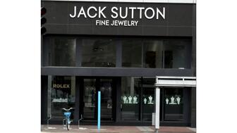
Jack Sutton Fine Jewelry is closing its store inside the downtown shopping center after 40 years in business.

Reena Ahluwalia’s painting of the rare red diamond is the first contemporary painting to join the National Gem Collection.
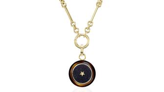
The price of gold has risen, affecting the number of pieces designers make, the materials they use, and how they position themselves.

The 11-piece “Medallions” capsule collection features five motifs: a crying eye, a heart on fire, a spiral, a flower, and a swallow.

From Gen Z’s view of luxury to “doom spending,” these are the six consumer trends to note this year.

The partners have announced the second cycle of the program, which has expanded to include a $25,000 student scholarship.

The owners of Staats Jewelers are heading into retirement.

Jeffrey Gennette, who retired in 2024 after 41 years with Macy’s, is the newest member of the jewelry retailer’s board of directors.
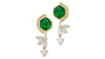
May babies are lucky to have emeralds, a gemstone admired for centuries, as their birthstone, writes Amanda Gizzi.

The new module allows retailers to plan, promote, and measure the success of events from a single dashboard.

NDC said in an open letter that Pandora’s statements about the carbon footprint of lab grown versus natural diamonds are inaccurate.

The diamantaire and industry leader succeeds Feriel Zerouki and said he will focus on being a “champion” for natural diamonds.

She wore our Piece of the Week, Glenn Spiro’s “Old Moghul Golconda” earrings, featuring fancy brown-yellow diamonds totaling 51.90 carats.
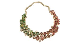
Two pieces were named “Best in Show,” one from the retail category and one from the supplier category.

The jewelry retailer noted resilience among its higher-end customers while demand softened for its lower-priced offerings.
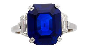
Led by the 6.59-carat sapphire, the sale garnered $9.7 million, a record total for a Heritage jewelry auction.

In his new role, sales specialist Billy Welshoff will focus on the eastern United States.

José Gaztelu has been promoted to the role, which has been vacant since last year.

It has also opened the application period for the Seymour & Evelyn Holtzman Bench Scholarship through June 30.


