The largest known fancy vivid blue-green diamond could fetch more than $12 million at its second auction appearance.

I have a confession to make: I shop at your store a lot.
I’m that maddening sale you think is going to happen but, 99 percent of the time, doesn’t progress any further than filling up that online shopping cart.
Like most consumers today, particularly my millennial cohort, I shop online a lot but it’s mostly just for research.
With information so easily available online, I can browse your inventory in a few minutes, pick out things I like and check to see if they’re available online anywhere else for less. Then I can fill up a cart with all of the things I’d like to buy and … think about it.
Buying online is second nature to my digital-native generation. It’s become my preferred mode of shopping because it helps me avoid hassles—the time spent getting to a store, dealing with crowds or encountering an in-store selection that is more limited than its online counterpart (the new retail refrain always seems to be, “You can probably find it if you look on our website!”).
And though browsing jewelry online is part of my job, because it helps me see what retailers are selling, I also find online shopping to be a stress reliever. It is a belief I think many other millennials share, though research about the psychology of “retail therapy” has pretty much only focused on the brick-and-mortar experience thus far.
Make no mistake, though I love filling up online shopping carts with things I’d potentially like to buy and I take great, anxiety-reducing satisfaction in a well-curated cart, I make the vast majority of my purchases online too.
But there are a few things that stop me.
As your resident secret online shopper (whom you never hired), I’m going to fill you in on what keeps me from clicking the “Purchase” button at your store to better inform your e-commerce best practices.
1. You’re Not Showing Scale
At a panel at the Vicenzaoro jewelry trade show this year, Farfetch’s global vice president Jamie Freed noted how, over time, consumers have demonstrated their growing confidence in buying fine jewelry online by engaging in increasingly larger transactions, with purchases of pieces over $20,000 on the rise.
But there are special considerations to buying fine jewelry over the internet and a major one is scale.
An image of a piece of jewelry being
It’s not easy to visualize the scale of an item by its listed measurements and specifications alone.
Much like a handbag, if I can’t see how large a piece is in relation to the human body I simply can’t picture it, so I can’t buy it. I need to see a ring on the finger, a pendant around someone’s neck, etc.
In my opinion, if you’re not going to show a piece of jewelry being worn, you might as well not show it at all.
The image I need to feel confident in the size and shape of said jewel doesn’t require an expensive professional photo shoot; a clear iPhone snap of the item on a sales associate is all you need.
2. Your Return Policy Is Not Clearly Stated
Call me spoiled, but successful online sellers have set the bar high for the experience I’m expecting to have online and today, that means free shipping and returns.
As shoppers, we’ve become so used to cost-free deliveries that it’s surprising when we do end up with a shipping or return fee and, for me, it’s a purchase deterrent.
Likewise, if a return period is less than the retail standard – 30 days – I feel duped, almost as if a company is hoping I wouldn’t notice and therefore miss the opportunity to send something back if I’m unhappy with it.
Fine jewelry has its nuances compared to other categories and there might be instances where an item is ineligible for return—say, when a piece of jewelry has been made to order.
It’s imperative that that type of information is clearly communicated to shoppers, not in fine print but directly and totally up front to build consumer trust, with potential buyers knowing exactly what kind of commitment they’re making.
3. Your Website is Your Pet Project
My final critique is an issue I tend to encounter more with jewelry designers’ individual e-commerce sites than with the websites of retail stores, independently owned or otherwise.
Again and again, I visit websites with more information than I need, leaving me to sift through content when trying to find simple product information.
I understand why designers do this—they know that it’s not enough to make and sell their jewelry today; they must create stories around it, send out newsletters and e-mails and make note of illustrious press features—but many take it too far.
The most important feature I need to see on a jewelry-selling website is a highly visible menu giving me access to the pieces they’re selling, letting me scroll through all the inventory and items by category (rings, earrings, bridal, etc.).
When I go to a website and get stuck on a fancy, carefully designed landing page that makes me click to “enter” said domain or makes me scroll through beautifully crafted content to eventually select a “Shop Now” button, I’ve already lost some interest.
The underlying issue is the same for the previous tips I’ve shared—a lack of efficiency and ease. Rather than hold online shoppers hostage with content, take them to one homepage that lets them get straight to their shopping via a clear navigation menu and presents some teasers to content, giving them the choice to click on what they’d like.
And when it comes to navigation, please, forego the collection names.
Collections are important to you; they are not important to your audience. We’re shopping with you because we love your jewelry, but we rarely remember which pieces came out when and why.
If you must include, leave an option for browsing by collection and for browsing by category.
Your online shopper is moving faster than you realize—it’s your job to keep up with her.
The Latest

Emmanuel Raheb says jewelers need to start marketing early and make it easy for customers to pick a gift for mom.
In honor of the milestone, the Nebraska jeweler has debuted Leslie & Co., its new in-house jewelry brand.
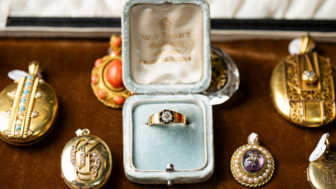
Gain access to the most exclusive and coveted antique pieces from trusted dealers during Las Vegas Jewelry Week.

The trade organization, which held its annual elections earlier this year, also added five new board members.

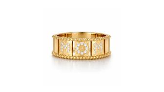
NRF’s annual survey found that 45 percent of consumers plan to purchase jewelry for a loved one this Mother’s Day.
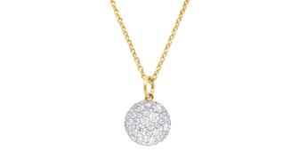
The “Vault” charm, our Piece of the Week, expands on the memories that can be stored in a locket by connecting to your phone.

Gain access to the most exclusive and coveted antique pieces from trusted dealers during Las Vegas Jewelry Week.
The open-to-the-public luxury jewelry and timepiece show, in its second year, is slated for July 23-26.

The jeweler’s Mother’s Day campaign highlights the women who work there—mothers, grandmothers, women who want to be mothers, and dog moms.

Sponsored by Jewelers Mutual

The proposed agreement follows the moissanite maker’s Chapter 11 bankruptcy protection filing last month.
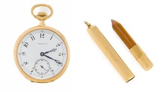
The Patek Philippe for Tiffany & Co. timepiece Astor brought aboard the ill-fated ship sold for double its estimate at a Freeman’s auction.
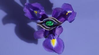
The “Dalí’s Garden” collection was inspired by a surreal dream Neeley had after cooking a recipe from Salvador Dalí’s 1973 cookbook.

Natalie Feanny has been appointed to the role.

The pair falsely claimed their jewelry was made by Navajo artists, but it was imported from Vietnam.
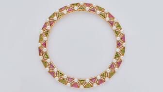
Julien’s Auctions is selling the musician’s fine and fashion jewelry alongside her clothing, gold records, and other memorabilia.
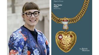
Rachel King’s book dives into the history of the pendant believed to have belonged to Henry VIII and his first wife, Katherine of Aragon.

The company will have deals on precious metals testers as well as the latest in lab-grown diamond detection technology and security.

Gabrielle “Coco” Chanel is a character in the “Coco Game” collection of watches and the queen in its first haute horlogerie chessboard.

The annual list honors rising professionals on the retail and supply sides of the jewelry industry.
Seized in Kentucky, the packages include fake Cartier, Tiffany & Co., Chanel, and Fendi jewelry.

Rodolfo Lopez-Portillo faces 25 years to life in prison after being found guilty in the March 2022 beating death of Arasb Shoughi.
“Jewelry Creators: Dynamic Duos and Generational Gems” highlights the relationships among 22 influential designers, brands, and gem dealers.

The AJS Spring 2027 show will be held in Savannah, Georgia, with future shows taking place in other Southeast cities.

The jewelry retailer plans to open 20 new stores this year and expand into new product categories.
Flower motifs are the jewelry trend blooming amongst the new collections that debuted this spring.

