The largest known fancy vivid blue-green diamond could fetch more than $12 million at its second auction appearance.
The PR Adviser: Dear Lilian
Lilian Raji took a break from her spectacular Italian vacation to help a jeweler in Barbados who’s looking to redesign her website.

Dear Lilian,
Many thanks for your informative articles.
I have decided after 17 years to do a new website. My current website is lovely but not interactive. I want this site to be really user friendly, require use of a password in order to view collections and have awesome photography.
I have two shops in Barbados and would like the website visitors to have an “interactive” experience when on the site. Most people are seeing your website before your shop. How can I get the private- jeweller-of-Barbados feel on a website?
Heather Harrington Jones
----------
Hello Heather,
Hopefully, you and my wonderful readers are having a fantastic summer! I write to you now from the breathtaking shores of Capri, which the Italians have ardently informed me is pronounced KAH-pree.
It’s only fitting your email is my next focus as I’ve heard Barbados’ shores are just as spectacular!
I, and my dear friend Christina Hagopian of Hagopian Ink, have reviewed your website. Christina’s business is ensuring that the first impression her luxury clients’ receive is that they deserve whatever price tag they command.
Let’s start with your website’s biggest problem; this far outweighs your website’s lack of interactivity because, as it currently stands, your website can’t be found organically.
In April 2015, Google introduced major changes to their ranking system. Google declared that if a website doesn’t look good on mobile devices, well, gosh darn it, it’s not good enough to acknowledge! Christina spent early 2015 getting her clients’ websites updated, and this is what you must do.
As you’re evaluating web designers, the first question you must ask--repeat after me, dear--are you fluent on everything that will make Google happy with my site?
Next, your desire to be positioned as the private jeweler of Barbados is commendable. A strong positioning serves as a shield against competitors.
However, I assure you your customers care less about you being the private jeweler of BARBADOS, and more about you being THE PRIVATE JEWELER of Barbados. They care more about what you offer and less about your location.
“Your jewelry needs to be front and center,” Christina recommends. “Make Barbados secondary to your primary purpose, which is providing an elite selection of jewelry they can’t find anywhere else.”
To do this, you may have to reconsider password-protecting your site.
Don’t get me wrong. I love the idea of making customers feel special with invitation-only access.
Christina and I differ on which luxury website offers the most inspiring design. Christina is all-American with Tiffany & Co. And I, who’s never seen a flute of Taittinger (or any other French product for that matter) I didn’t immediately want, j’aime Cartier.
We’re both right for different reasons. Albeit, for a budget less than a tenth of Cartier’s annual earnings, Tiffany’s website is your better muse.
What we want you to notice on Tiffany’s site, first and foremost, is the white background.
“You want a white background because jewelry shows up best on white,” Christina advises. “Black is a very difficult color to work with in web design.”
Christina recommends banner imagery for your home page. Banners spread across a browser’s full width, and when properly designed, welcome in visitors. They highlight immediately your unique positioning while luring visitors deeper into the site.
Integrate Barbados by using subtle allusions to your island. Perhaps conduct a photo shoot with your vendors’ jewelry elegantly styled on beach sands. Or have a woman wearing your vendors’ gems standing before an exquisite golden sunset over the Atlantic Ocean.
If you don’t want to invest in a photo shoot, ask your vendors to provide you with high-resolution images. For your home page, include a few revolving banner images from brands exclusive to you. Make sure you prominently note somewhere on those images “Available exclusively at Heather Harrington Jones.”
Your vendors, Doves by Doron Paloma, Mattioli, and Oromalia, all have gorgeous pictures on their home pages they might be willing to provide in exchange for photography credit. I personally love Vendorafa Italy’s home page image of jewelry-as-leaves. It tells a million stories, all of which end with “what else is available from Vendorafa?”
After your home page shows them a bit of leg, the rest of your site should whisper “come hither,” with “hither” being your “Contact Us” page.Hmm … is it just a coincidence that I’m referencing mostly your Italian vendors, or have I drank one too many Limoncellos here on the Caeser Augustus hotel terrace to see anything other than prodotti di Italia?
Perhaps that’s a question best answered after another Chianti.
Back to your website.
The very essence of creating an experiential site is to evoke emotion from visitors. Emotions are the quintessence of luxury.
Your new website’s job, Heather, love, is to tease potential customers with products extraordinarily different from other Barbadian jewelers--products exclusive only to you.
After your home page shows them a bit of leg, the rest of your site should whisper “come hither,” with “hither” being your “Contact Us” page.
Use your “About Us” page to declare your ties to Barbados. Have fun with a Barbados-inspired photo shoot, where you serve as supermodel in stunning jewelry. Match your photos with a personal testimony as to why you love the island.
Your “Designers” page requires a white background. Multiple images set on a black background are visually disruptive. Luxury is all about ease. Make things easy on the eyes.
Christina and I highly recommend featuring more than two products on your vendors’ individual pages. Give your potential customers something to lust after. If they’re not already familiar with Tagliamonte, two random images won’t solicit a call with their Centurion card number to get your latest Tagliamonte exclusive.
We recommend at least six to eight product images per vendor. Plan on updating images monthly so customers have reason to come back to your site regularly.
Assuming you’re not planning an e-commerce site, still allow customers to click through your vendors’ product images. The subsequent page should feature an enlarged image, product name or number, and description.
Because you are not selling online, rather than listing prices, use “Contact us for pricing.” The name and/or number will make it easier to know which item is being summoned to your customer’s jewelry collection.
Lastly, create a monthly email newsletter and encourage all site visitors to subscribe. A newsletter as simple as “what Heather found this month” will do, with a picture of your recently discovered gem and the designer’s bio. Mind you, “recently discovered” is subjective, so don’t feel you have to be on a monthly hunt for something new to feature. Last year is more recent than five years ago!
Now darling Heather, this is where I must leave you. I saw a gorgeous Damiani ring in Quisisana Hotel’s lobby showcase yesterday on my way to their pool and I must now contact them for pricing.
Thank you, Christina, for your contributions.
Ciao bello, beloved readers. Until next month--and please send me your pressing PR and marketing questions!
Lilian Raji is a strategic marketing and public relations adviser who helps luxury lifestyle brands sell more products to luxury buyers. Send questions for The PR Adviser to nationaljeweler@lmrpr.com or contact her at lilian@lmrpr.com. Follow her on Facebook, Twitter, Instagram and Pinterest.
The Latest

Emmanuel Raheb says jewelers need to start marketing early and make it easy for customers to pick a gift for mom.

In honor of the milestone, the Nebraska jeweler has debuted Leslie & Co., its new in-house jewelry brand.
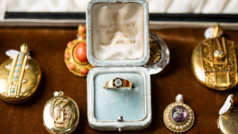
Gain access to the most exclusive and coveted antique pieces from trusted dealers during Las Vegas Jewelry Week.

The trade organization, which held its annual elections earlier this year, also added five new board members.

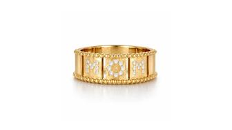
NRF’s annual survey found that 45 percent of consumers plan to purchase jewelry for a loved one this Mother’s Day.
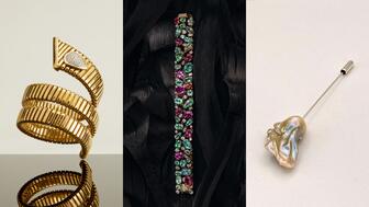
The open-to-the-public luxury jewelry and timepiece show, in its second year, is slated for July 23-26.

Gain access to the most exclusive and coveted antique pieces from trusted dealers during Las Vegas Jewelry Week.

The jeweler’s Mother’s Day campaign highlights the women who work there—mothers, grandmothers, women who want to be mothers, and dog moms.

Sponsored by Jewelers Mutual
The proposed agreement follows the moissanite maker’s Chapter 11 bankruptcy protection filing last month.
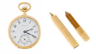
The Patek Philippe for Tiffany & Co. timepiece Astor brought aboard the ill-fated ship sold for double its estimate at a Freeman’s auction.
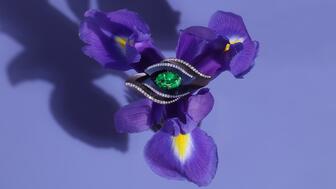
The “Dalí’s Garden” collection was inspired by a surreal dream Neeley had after cooking a recipe from Salvador Dalí’s 1973 cookbook.

Natalie Feanny has been appointed to the role.

The pair falsely claimed their jewelry was made by Navajo artists, but it was imported from Vietnam.
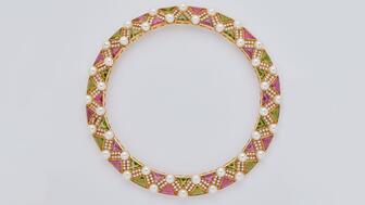
Julien’s Auctions is selling the musician’s fine and fashion jewelry alongside her clothing, gold records, and other memorabilia.
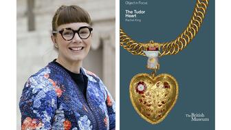
Rachel King’s book dives into the history of the pendant believed to have belonged to Henry VIII and his first wife, Katherine of Aragon.

The company will have deals on precious metals testers as well as the latest in lab-grown diamond detection technology and security.

Gabrielle “Coco” Chanel is a character in the “Coco Game” collection of watches and the queen in its first haute horlogerie chessboard.

The annual list honors rising professionals on the retail and supply sides of the jewelry industry.
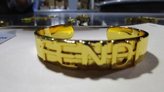
Seized in Kentucky, the packages include fake Cartier, Tiffany & Co., Chanel, and Fendi jewelry.

Rodolfo Lopez-Portillo faces 25 years to life in prison after being found guilty in the March 2022 beating death of Arasb Shoughi.
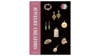
“Jewelry Creators: Dynamic Duos and Generational Gems” highlights the relationships among 22 influential designers, brands, and gem dealers.

The AJS Spring 2027 show will be held in Savannah, Georgia, with future shows taking place in other Southeast cities.

The jewelry retailer plans to open 20 new stores this year and expand into new product categories.
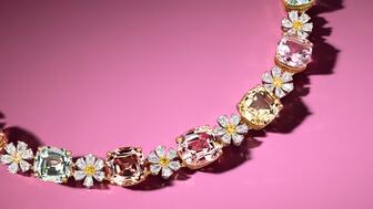
Flower motifs are the jewelry trend blooming amongst the new collections that debuted this spring.

The retailer reported an 8 percent decline in annual sales as it struggles under the weight of billions of dollars of debt.

